When: 2018
Role: UI Designer
Objective: Create first iOS UI library for the new modernization initiative.
Results: Procore’s first UI library was launched and adopted across the design team,
and became the primary source of truth for designers and developers.
The Problem
Before the 2018 modernization the design team had never had an established style guide or
a library of components. Every time a designer needed to design a new tool or feature they
would take screenshots and work on top of it or try to quickly recreate the page.
The effects on the team
Not having a design library caused the team to waste unnecessary time recreating components and were always uncertain of what the correct characteristics were.
The effects on the user
The effects of not having a style guide caused many inconsistencies in the app that only caused confusion and worsened the overall user experience.
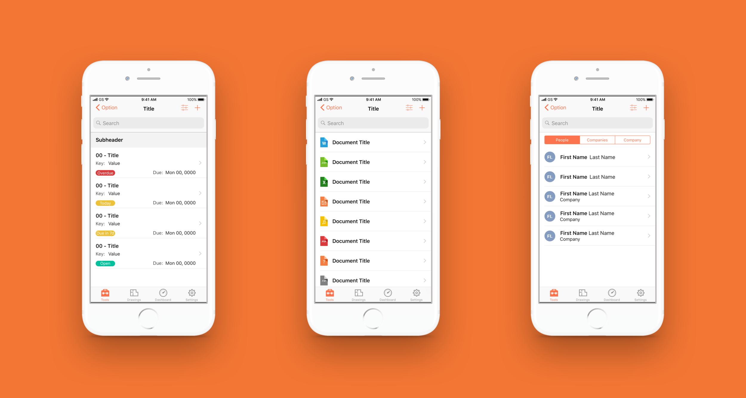
A few examples of the different page layouts in the iOS app.
The system
Typeface
To provide our users with the best legibility experience we decided to move forward with the iOS system typeface, SF Text.
Status Colors
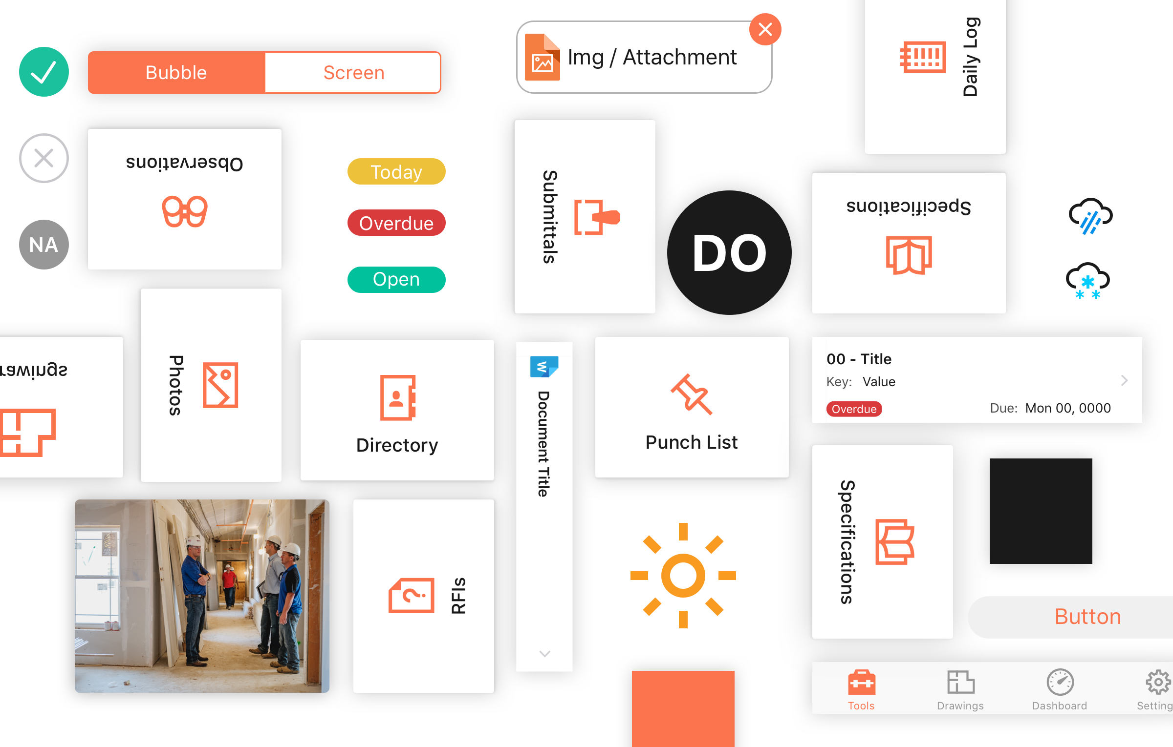
Procore mainly uses orange and black colors, this was a great opportunity to ensure our secondary colors be carefully selected to stand out and have meaning.
White Space & Shadows
Procore is heavy in content, for this reason we wanted to use white space and drop downs so our pages would feel less dense.
Iconography
We wanted a bold, straight edge, 2 px icons to represent our tool list. We also decided to use this style for all of our brand iconography.
Images
The Procore app is heavy with text content, to give the app more life we made the photography pop with a drop shadow.
App Icon
Procore is a utilitarian tool and it needs to standout from a sea of apps, this is why we decided to own the Procore orange and use it for our app icon.
Primary Colors
Procore is known for its construction bright orange, which is why we chose to use it as our key color.
Statuses
All of our statuses would now have a label ensure our users have clarity on the state of each item.
Sharing latest components with the team
To ensure the design team used the latest iOS UI components, we decided to use Sketches’ Craft Library. Craft library made it easy for me to quickly and easily update our components and increased the efficiency of the design team.
Components for list pages
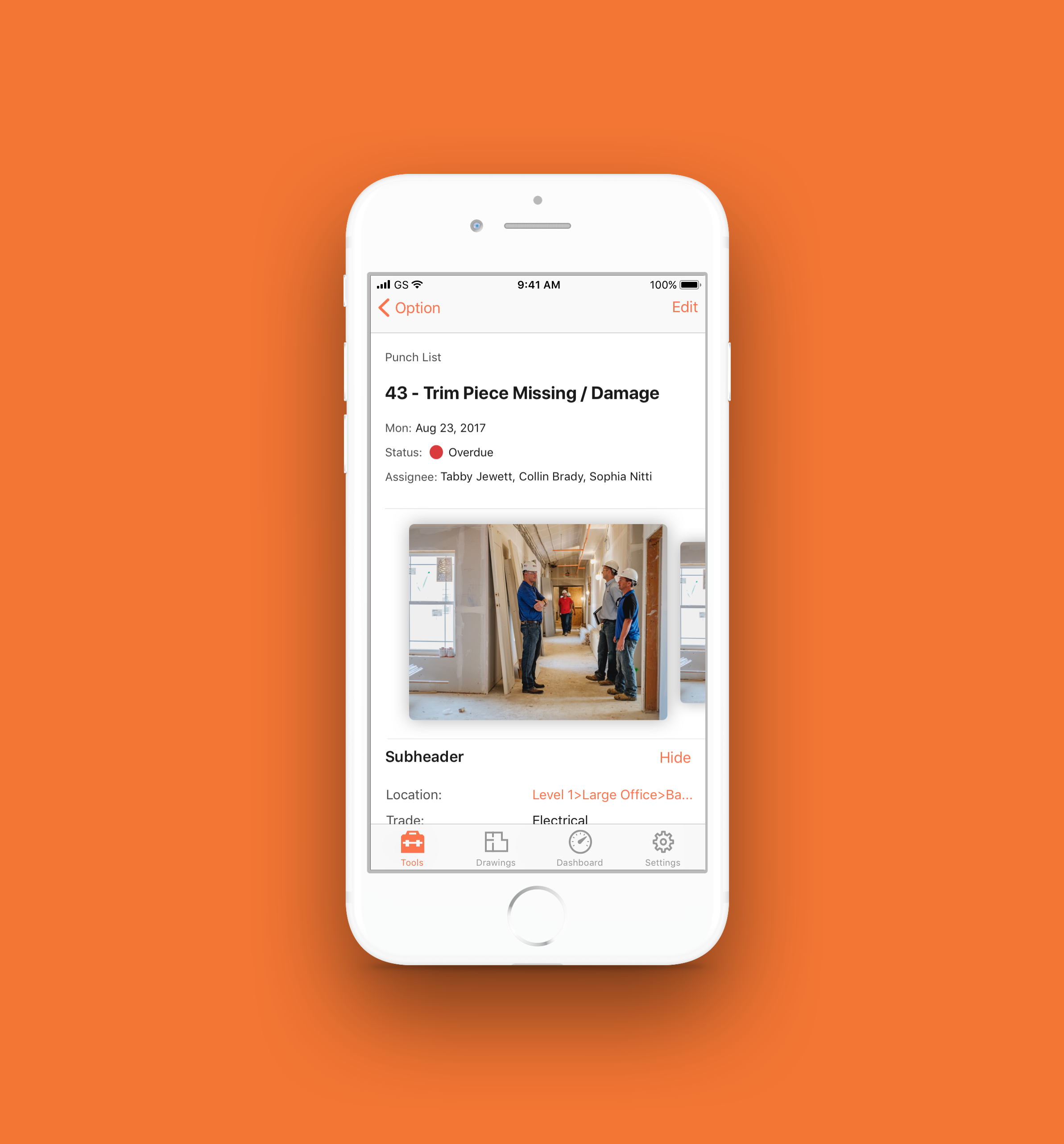
Components for detail pages
Outcome
The modernization of the iOS app and the introduction of the UI library changed the way our design team worked.
Improved team’s workflow
Empowered our team to propose new UI components and paradigms
Created a more unified and consistent experience for our users


