When: 2015
Role: Visual Designer
Other Designers: Jana McClure (UX Designer)
Objective: Simplify Procore’s UI look and unify Procore’s line of products.
The Problem
Procore's universal platform connects teams, applications, and devices in one centralized hub. Up until 2015 Procore had been designed by engineering and was an application that was continuing to grow with the lack of design guidance. In 2015 I worked closely with the UX designer Jana McClure and our marketing team to update Procore’s look and feel.
Design Problems:
• No brand color
• Over use of gradients
• No style guide
• No secondary button color
• Unnecessary drop shadows
Working with Marketing
To determine the colors and style direction I collaborated with the marketing team
creative director Karen Owens. Some of the style choices that were determined
with our collaboration are reflected in the outcome of the designs.
Outcome
Lato:
Previously Procore had been using inconsistently
Open Sans and Georgia. With the help of Procore’s creative director we decided to move forward and use Google’s Lato.
Brand color:
Procore’s desktop application had 5 different shades of orange. I worked with the marketing team to determine Procore’s final brand color.
Shades of grey:
For this visual update I created a final set of grays and determined Procore’s primary and secondary text color.
CTA button:
For the buttons I removed the gradients and made the buttons flat, but decided to keep the orange color for the primary buttons.
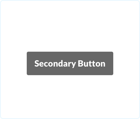
Secondary button:
To compliment the orange CTA button I made the decision to use gray as the secondary button color.
Before: Procore Logo
After: Procore Logo
White logo
Black logo
App Icon
Favicon Icon
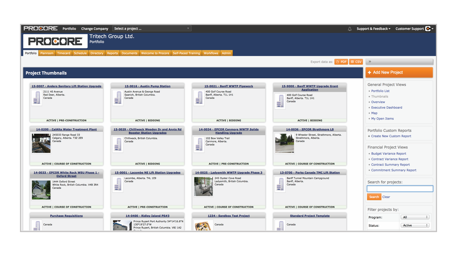
Desktop Application
Before list page
After visual update: company level
After visual update: List page
Procore Drive and Mobile
Before Procore Drive
Before Procore Mobile
After Procore Drive
After mobile


